CANVAS HOUSE
Services
BRAND IDENTITY DESIGN
Year
2025
Canvas House is a Lagos-based creative space built around a simple intention: to let African art, culture, and creative expression live beyond the gallery wall and into everyday life. It brings together artists, collectors, and curious minds, creating a place where dialogue, exchange, and discovery can happen naturally. At its core, Canvas House is about reassembling African creativity: honouring where it comes from, while expanding how it exists in contemporary culture.
Canvas House is a Lagos-based creative space built around a simple intention: to let African art, culture, and creative expression live beyond the gallery wall and into everyday life. It brings together artists, collectors, and curious minds, creating a place where dialogue, exchange, and discovery can happen naturally. At its core, Canvas House is about reassembling African creativity: honouring where it comes from, while expanding how it exists in contemporary culture.
The founders approached Jovae with this vision already well defined: a cultural house that could hold exhibitions, conversations, and community under one roof, while still feeling like a living, evolving space. Our role was to translate that foundation into a system that could carry both structure and expression with equal weight.
The founders approached Jovae with this vision already well defined: a cultural house that could hold exhibitions, conversations, and community under one roof, while still feeling like a living, evolving space. Our role was to translate that foundation into a system that could carry both structure and expression with equal weight.
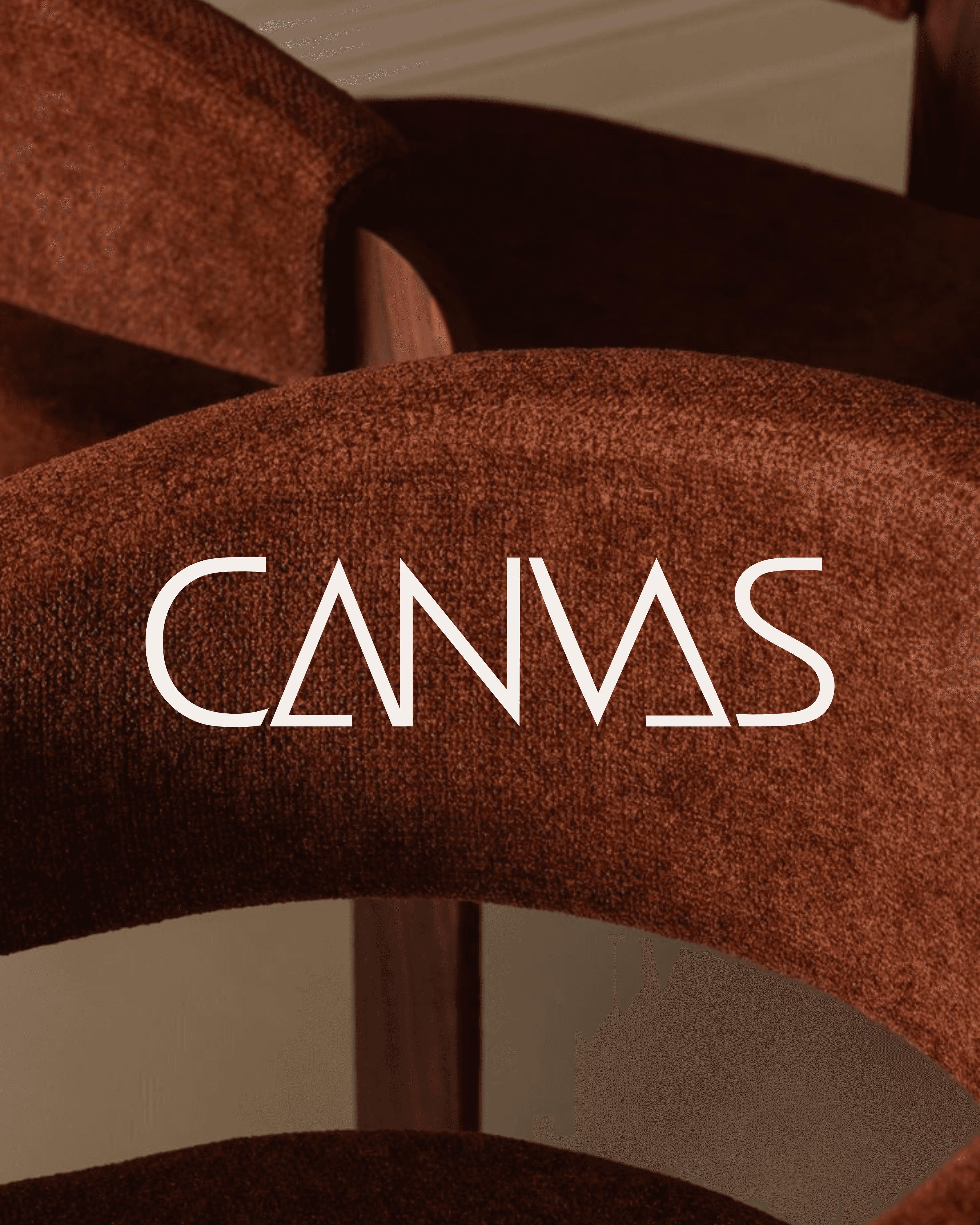
The wordmark became the anchor of the identity. We kept it bold, minimal, and grounded, using a clean sans serif that feels contemporary and confident. The letterforms are smooth and considered, with spacing that allows the name to sit calmly and clearly. Subtle refinements, particularly in the construction and connection of certain characters.
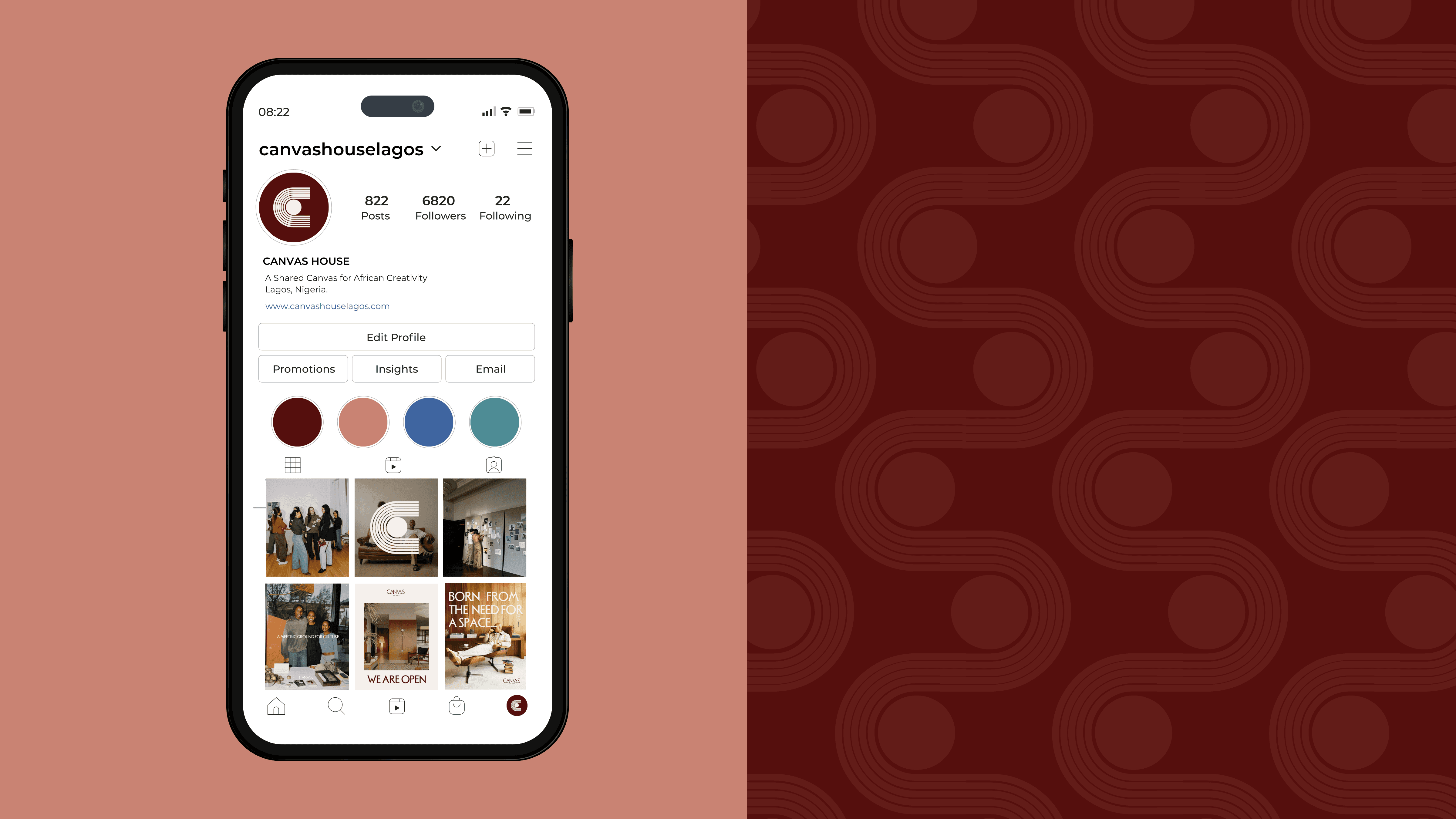
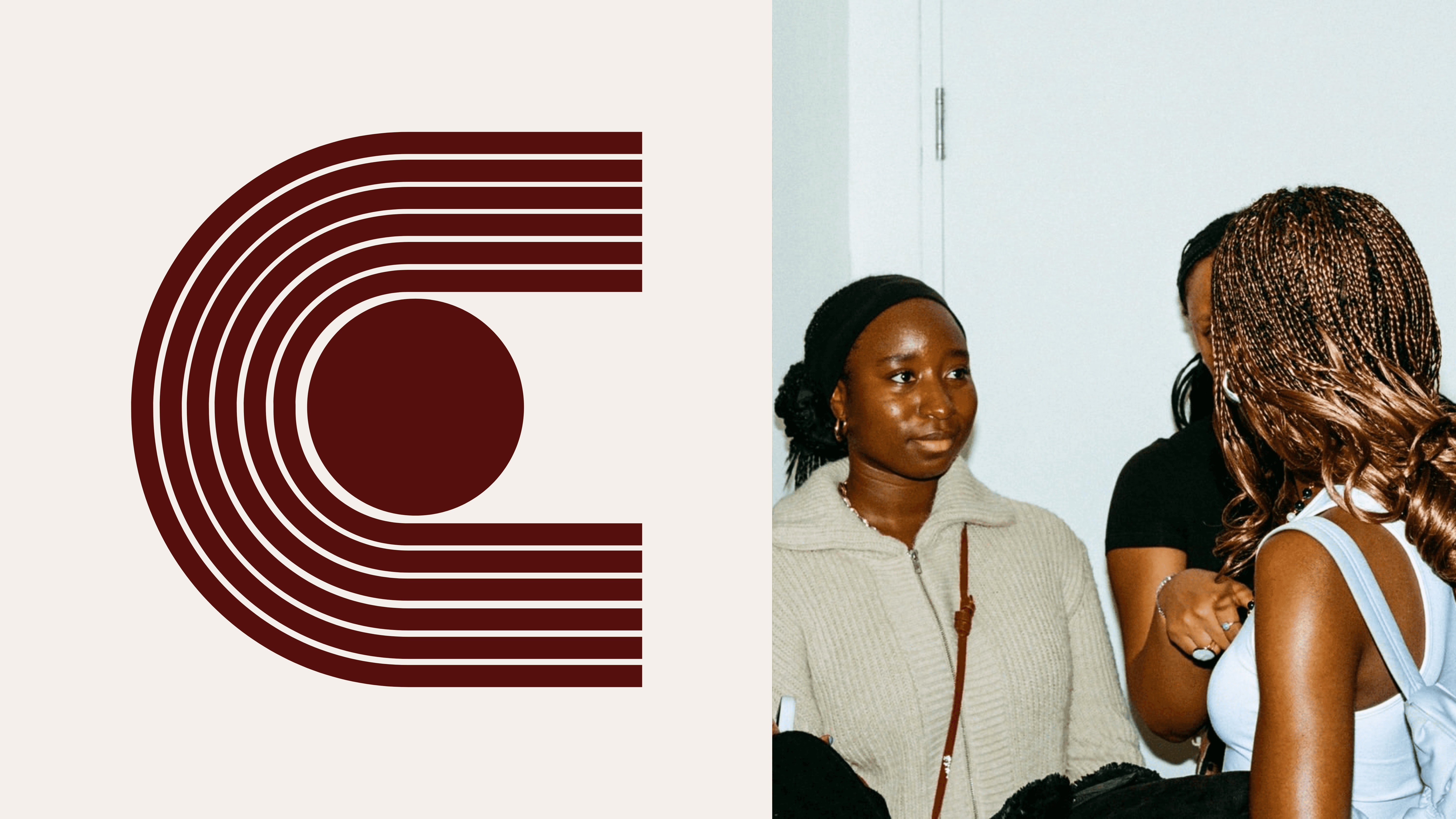
The submark moves into a more symbolic language. It is built from concentric lines forming a strong “C,” enclosing a central circle. That inner point reads as a sun, a gathering place, or a point of origin. The structure draws from visual systems found in African textiles and architecture, where repetition and pattern carry meaning as much as form does. It feels both ordered and expressive, holding a sense of cultural memory within a modern execution.
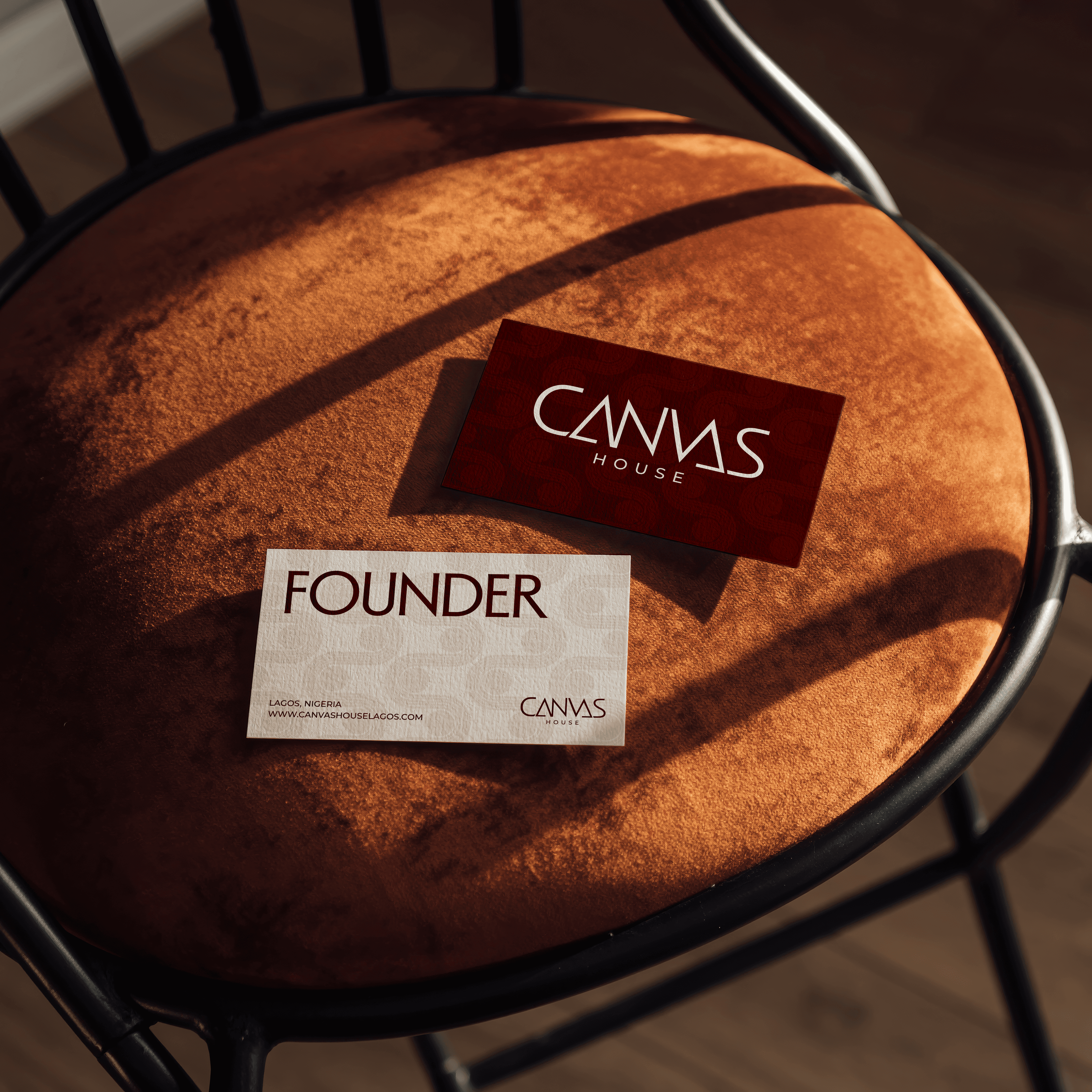
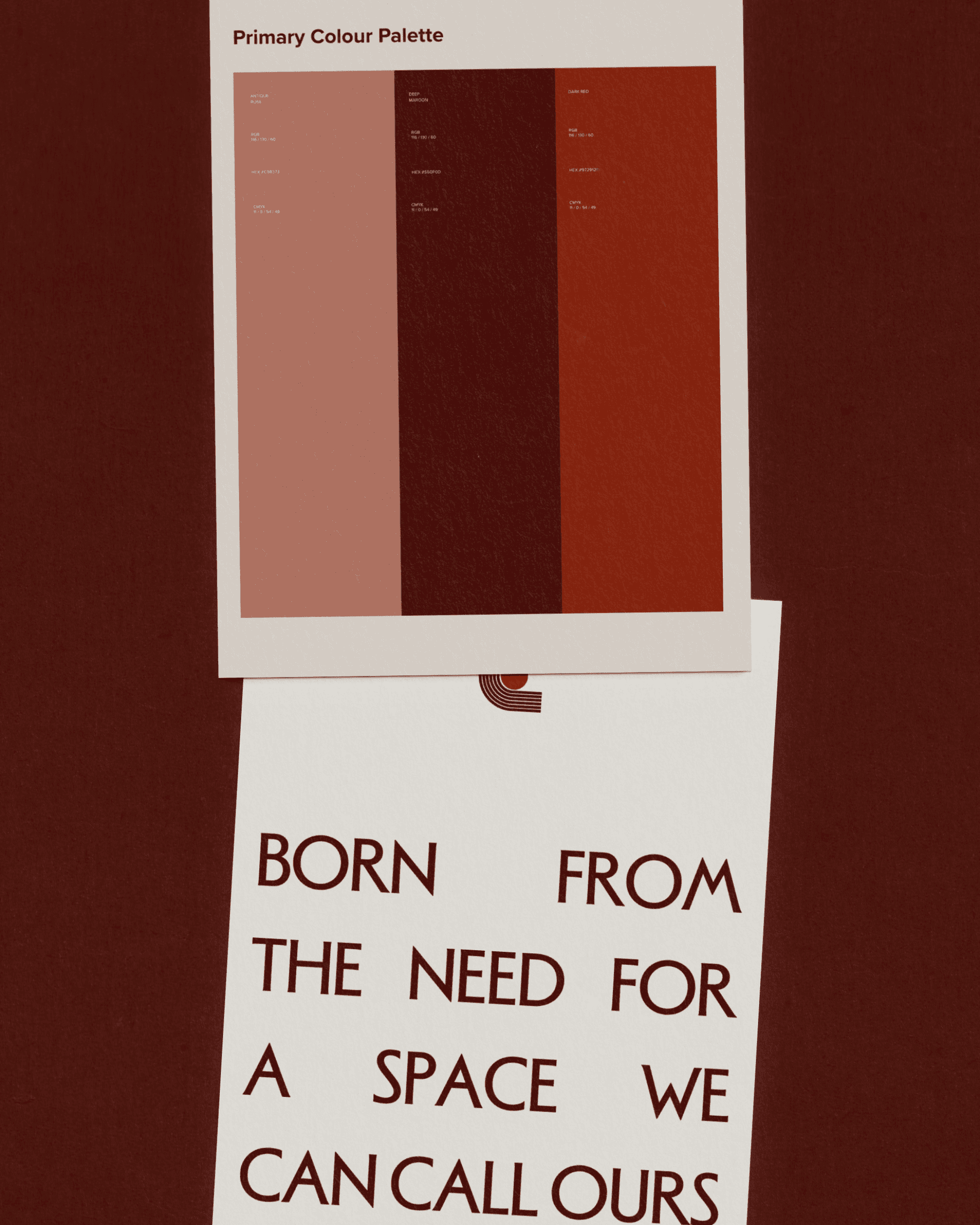
Across applications, the mark shifts easily between uses, functioning as a stamp, an embossed seal, or expanding into pattern systems. At every scale, it holds the same idea: Canvas House as a container for culture, built to preserve, display, and evolve it.
The wordmark became the anchor of the identity. We kept it bold, minimal, and grounded, using a clean sans serif that feels contemporary and confident. The letterforms are smooth and considered, with spacing that allows the name to sit calmly and clearly. Subtle refinements, particularly in the construction and connection of certain characters.
The submark moves into a more symbolic language. It is built from concentric lines forming a strong “C,” enclosing a central circle. That inner point reads as a sun, a gathering place, or a point of origin. The structure draws from visual systems found in African textiles and architecture, where repetition and pattern carry meaning as much as form does. It feels both ordered and expressive, holding a sense of cultural memory within a modern execution.
Across applications, the mark shifts easily between uses, functioning as a stamp, an embossed seal, or expanding into pattern systems. At every scale, it holds the same idea: Canvas House as a container for culture, built to preserve, display, and evolve it.