ZEN MOM
Services
VISUAL IDENTITY DESIGN
Year
2024
Zen Mom was built for the purpose of creating a space for mothers to slow down and reconnect with themselves. Not just in the big, visible moments of motherhood, but in the quieter ones too: the shifts, the pauses, the in-between stages that often go unnoticed.
When the project came to us, the foundation was already clear in its intent. Our role at Jovae was to translate that feeling into a visual identity, something that could carry calm, care and emotional depth, wrapped in the strength of motherhood.
Zen Mom was built for the purpose of creating a space for mothers to slow down and reconnect with themselves. Not just in the big, visible moments of motherhood, but in the quieter ones too: the shifts, the pauses, the in-between stages that often go unnoticed.
When the project came to us, the foundation was already clear in its intent. Our role at Jovae was to translate that feeling into a visual identity, something that could carry calm, care and emotional depth, wrapped in the strength of motherhood.
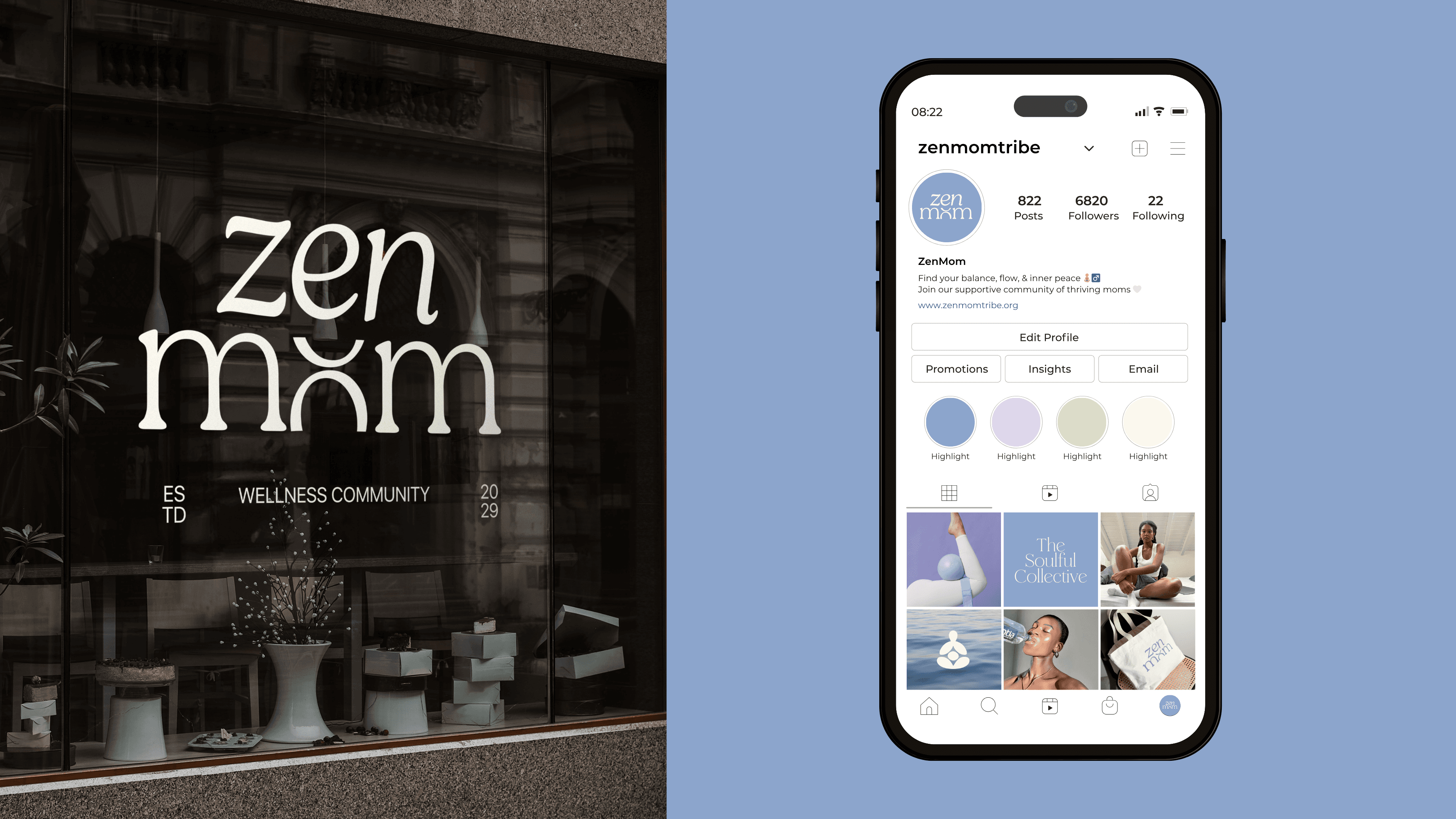
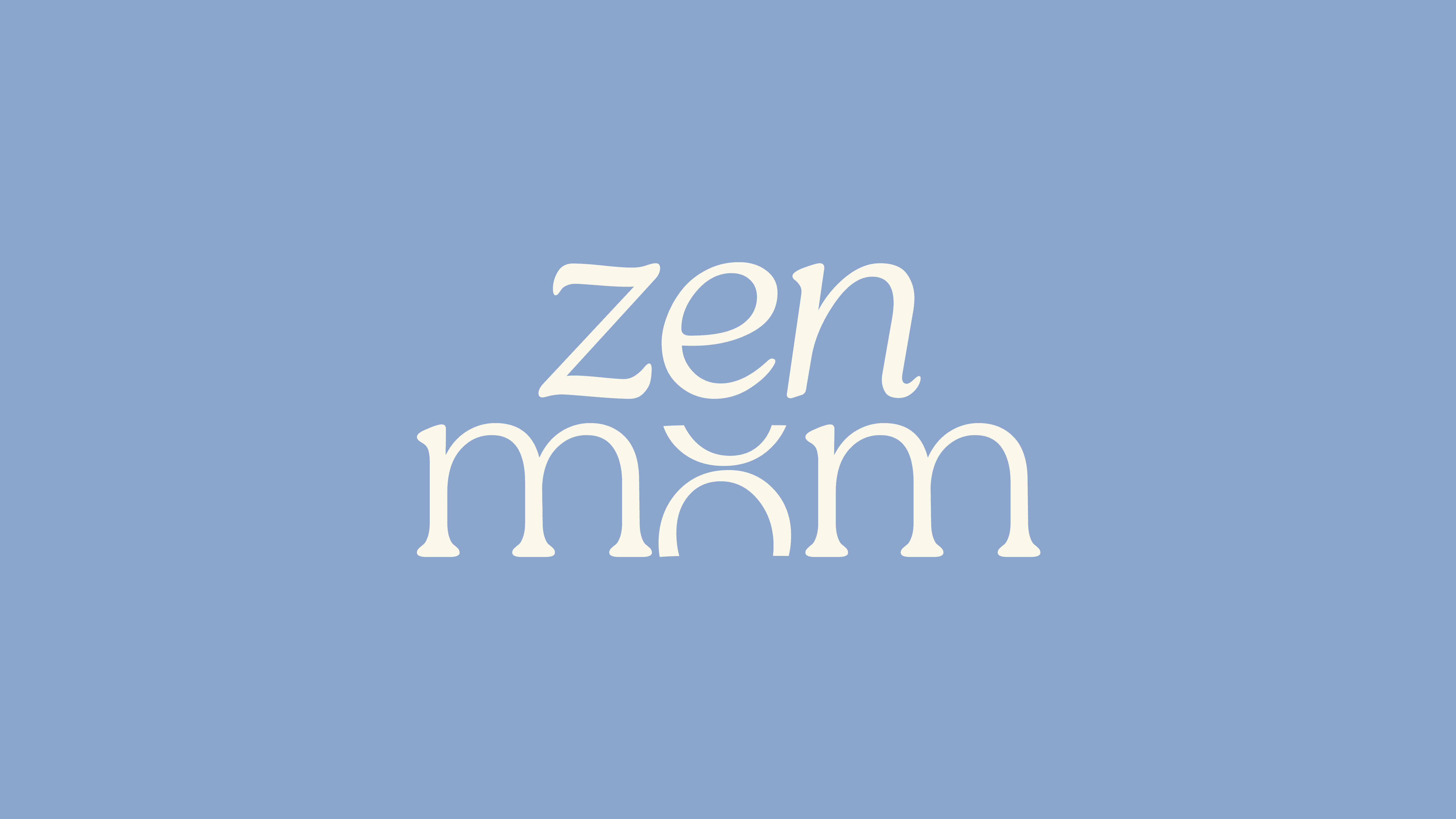
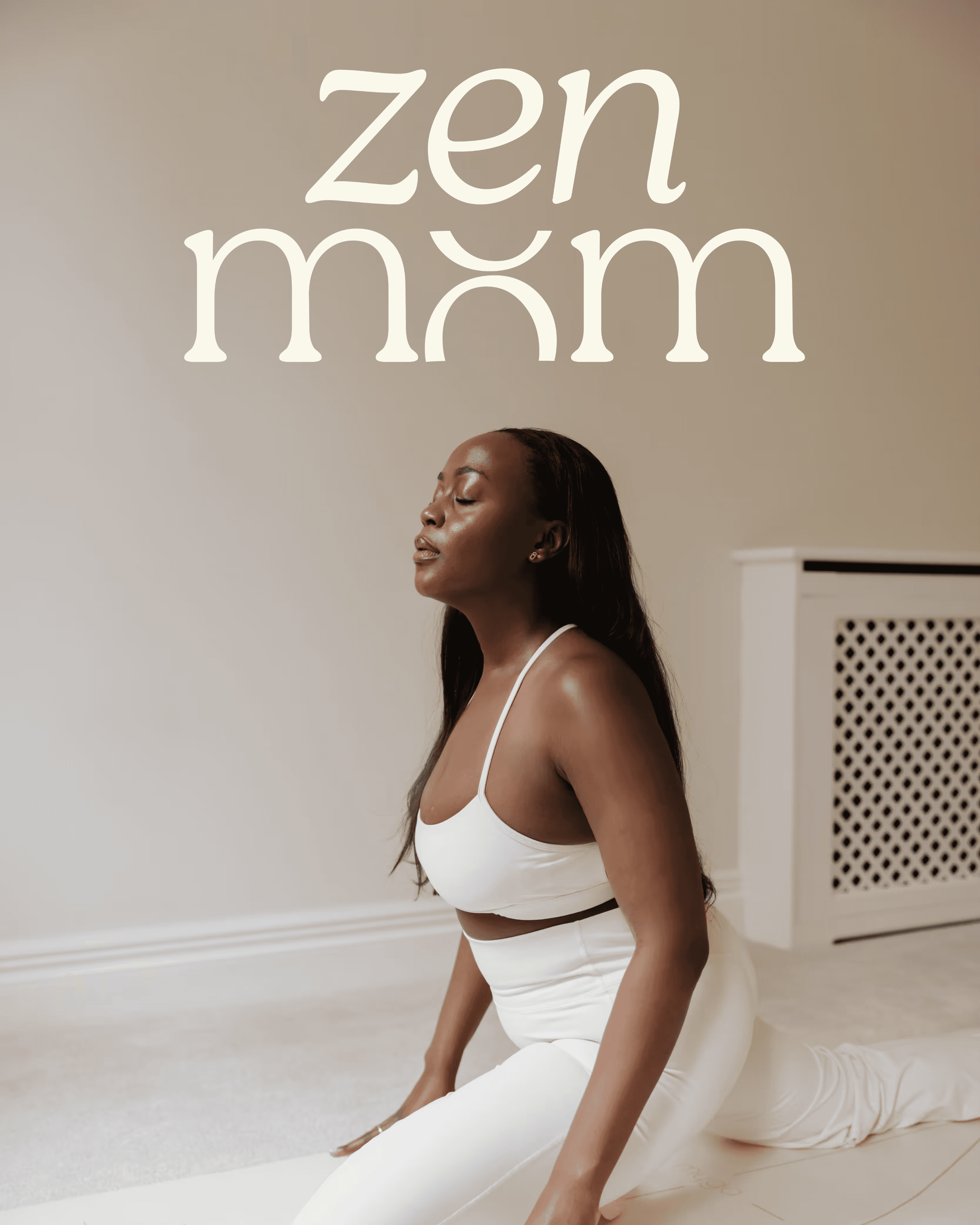
We started with the wordmark, looking for a type style that felt fluid and grounded at the same time. It needed a sense of ease to it, but also enough structure to hold its own. For Jovae, the most defining moment came through the “o” in “mom,” which we reworked into a subtle balance symbol. It sits quietly within the word, but shifts how it’s read, introducing the idea of balance while also hinting at the shared language of “mom” and “mum.”
We started with the wordmark, looking for a type style that felt fluid and grounded at the same time. It needed a sense of ease to it, but also enough structure to hold its own. For Jovae, the most defining moment came through the “o” in “mom,” which we reworked into a subtle balance symbol. It sits quietly within the word, but shifts how it’s read, introducing the idea of balance while also hinting at the shared language of “mom” and “mum.”
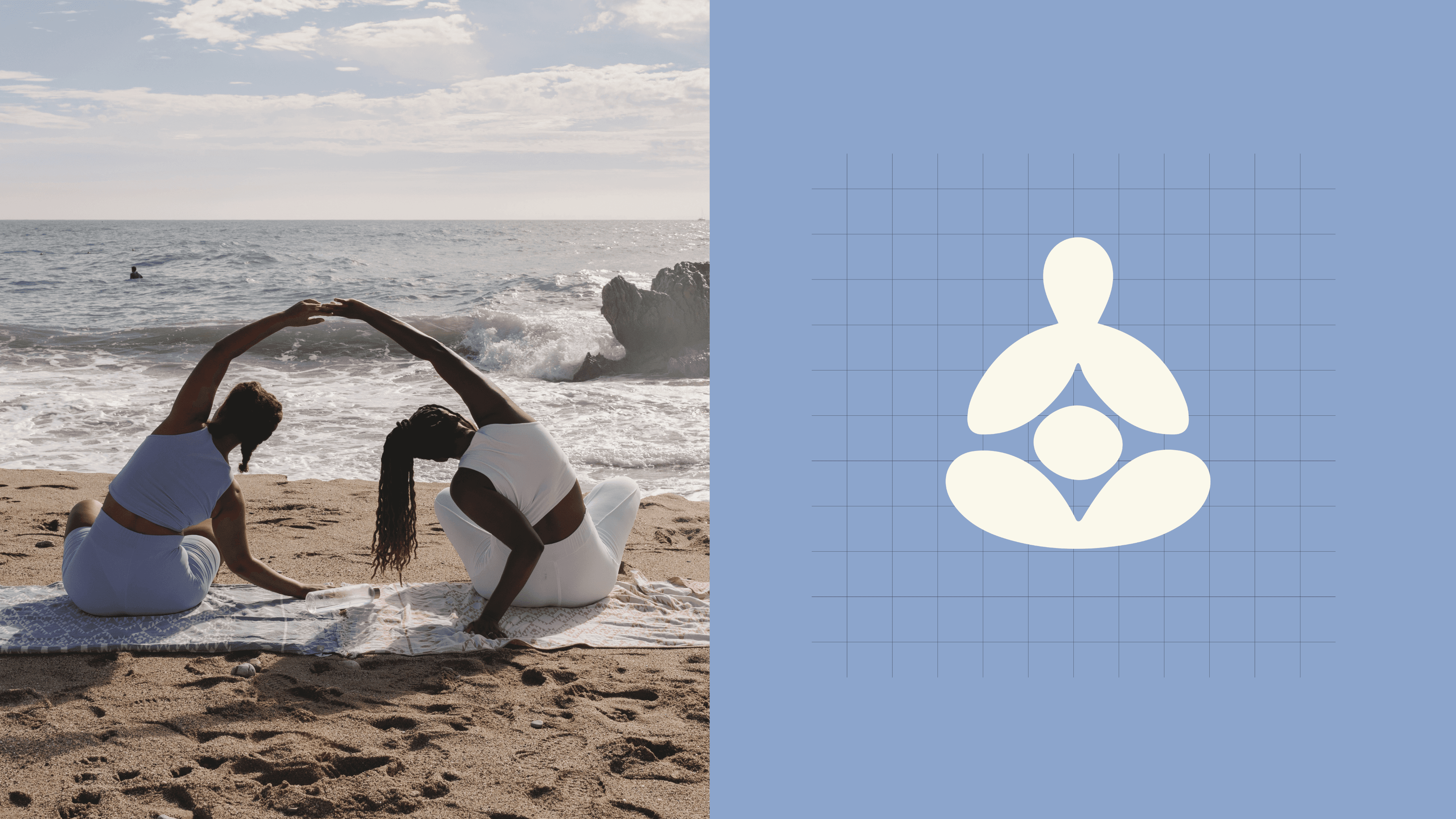
The Jovae team conceptualized the submark with simplicity at its core, centering it around an abstract figure of a woman in a meditative pose. This reflects the brand’s focus on inner peace, mindfulness, and the emotional experience of motherhood.
Soft, rounded forms were used to create a sense of warmth, comfort, and nurturing. The silhouette is intentionally fluid, allowing the mark to feel gentle and calm while still being clear and recognisable.
At the center of the submark is a circle, symbolising both the womb and the core of a woman. It represents life, grounding, and emotional connection, acting as the anchor of the entire form.
The Jovae team further developed a soft blue-led color palette to support the identity. The tone was intentionally chosen to evoke calm, stillness, and emotional ease in alignment with the brand DNA.
SERVICES
Visual Identity Design, Brand Collateral Design
CREDITS
Brand Strategy: Cohedom
The Jovae team conceptualized the submark with simplicity at its core, centering it around an abstract figure of a woman in a meditative pose. This reflects the brand’s focus on inner peace, mindfulness, and the emotional experience of motherhood.
Soft, rounded forms were used to create a sense of warmth, comfort, and nurturing. The silhouette is intentionally fluid, allowing the mark to feel gentle and calm while still being clear and recognisable.
At the center of the submark is a circle, symbolising both the womb and the core of a woman. It represents life, grounding, and emotional connection, acting as the anchor of the entire form.
The Jovae team further developed a soft blue-led color palette to support the identity. The tone was intentionally chosen to evoke calm, stillness, and emotional ease in alignment with the brand DNA.
SERVICES
Visual Identity Design, Brand Collateral Design
CREDITS
Brand Strategy: Cohedom